Introduction
Adversent is a digital marketing e-learning platform that targets young marketers, agencies, web designers and business owners who want to improve their marketing skills or set up a business.
I was tasked to improve the User Experience in mobile and re-design the UI in order to enhance the usability and the shopping experience.
1. Define
Goals : The objective is to make customer's life easier by simplifying the process of purchasing a product. To achieve this, we analysed other vendors in the education industry.
We discovered the following:
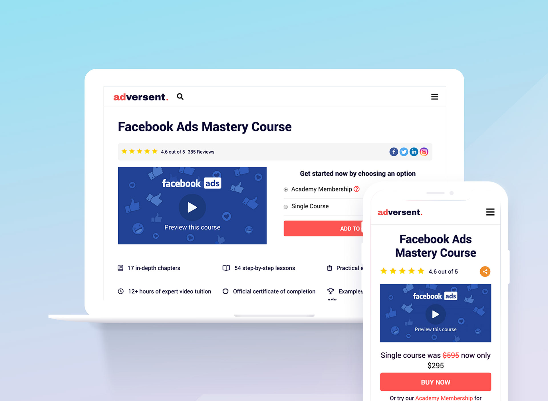
Product Image: We decided to create more attractive thumbnails and images to facilitate communicating what each course is for. This is a primary UX element to sell a product.
Product Name: It should be placed before the product image and include some descriptive words to engage the user.
Add to Cart: All of our competitors have strong call to action, for this reason we decided to have a large button with a unique colour to make it very visible.
Product Headline: We give the customer two purchasing options: buy a single product or try the membership for free.
Price: Because we were competing with other online education platforms, we decided to make the benefits of our products quite clear. Heighten both, the amount of training hours, and the quality of the material was a key selling factor.
Reviews: To gain customers trust and let them find out more information about the product.
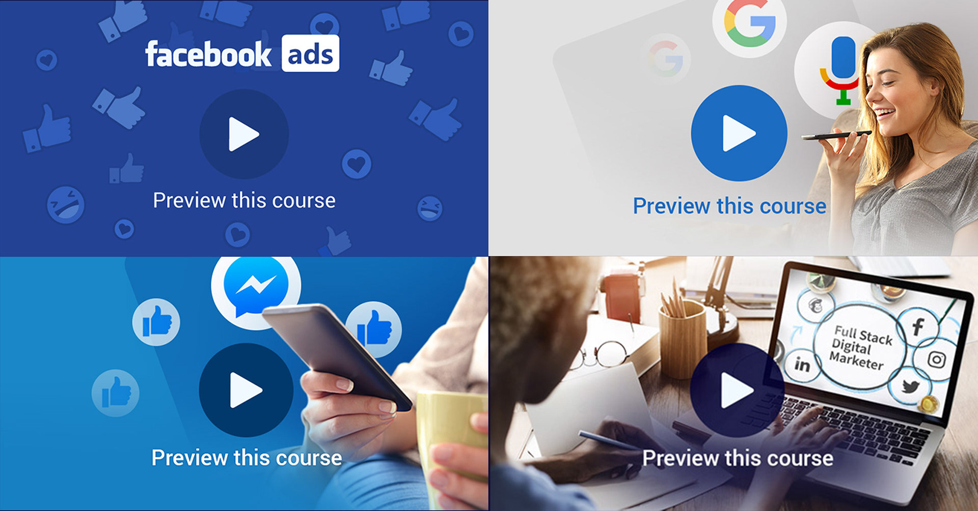
Product image examples
2. Users Research
Personas: To get a better understanding of our audience the design team worked close with the marketing team and senior software developers.
After applying several marketing research techniques, we found out that most of our customers were 23 - 40 years old females aiming to switch career or improve their current skills.

Social Media Banner that performed better on Facebook
3. User journey and Interaction
Wireframes: This phase involved sketching how the user would interact with the landing page, where he or she is going to purchase a course or buy a membership. Once this is approved, we had to think about the site responsiveness. Our data showed that Adversent's clients like to learn while commuting, so we went for an 'Adaptive' design that will correctly render itself for both desktop and most importantly, mobile devices.
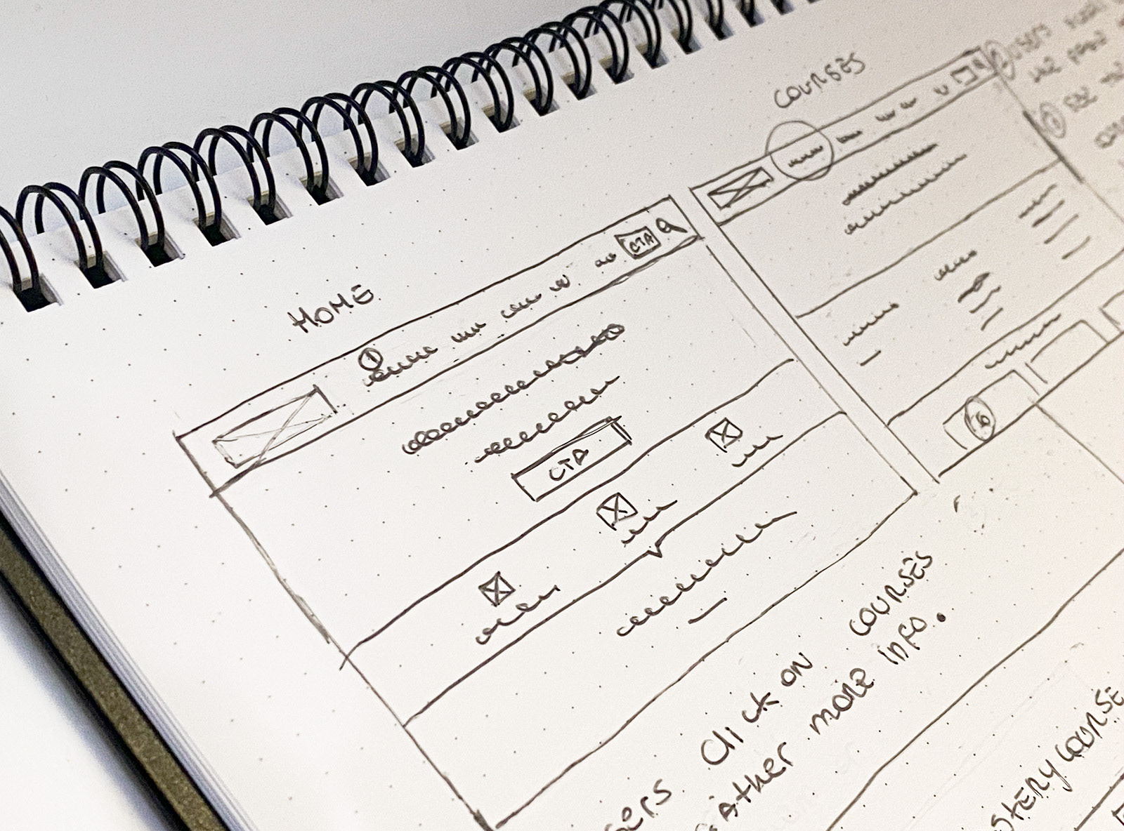
Illustration of user interaction

Desktop Wireframes

Mobile Wireframes
4. Visual
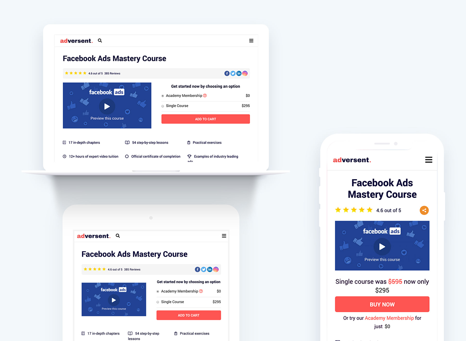
Mockups: High resolutions wireframes that shown the design across all device sizes for the entire platform were created. We built them iteratively and incrementally until everyone was happy with the final design. Furthermore, prototypes were also developed so everyone could have a clear idea on how the final product would look & feel.
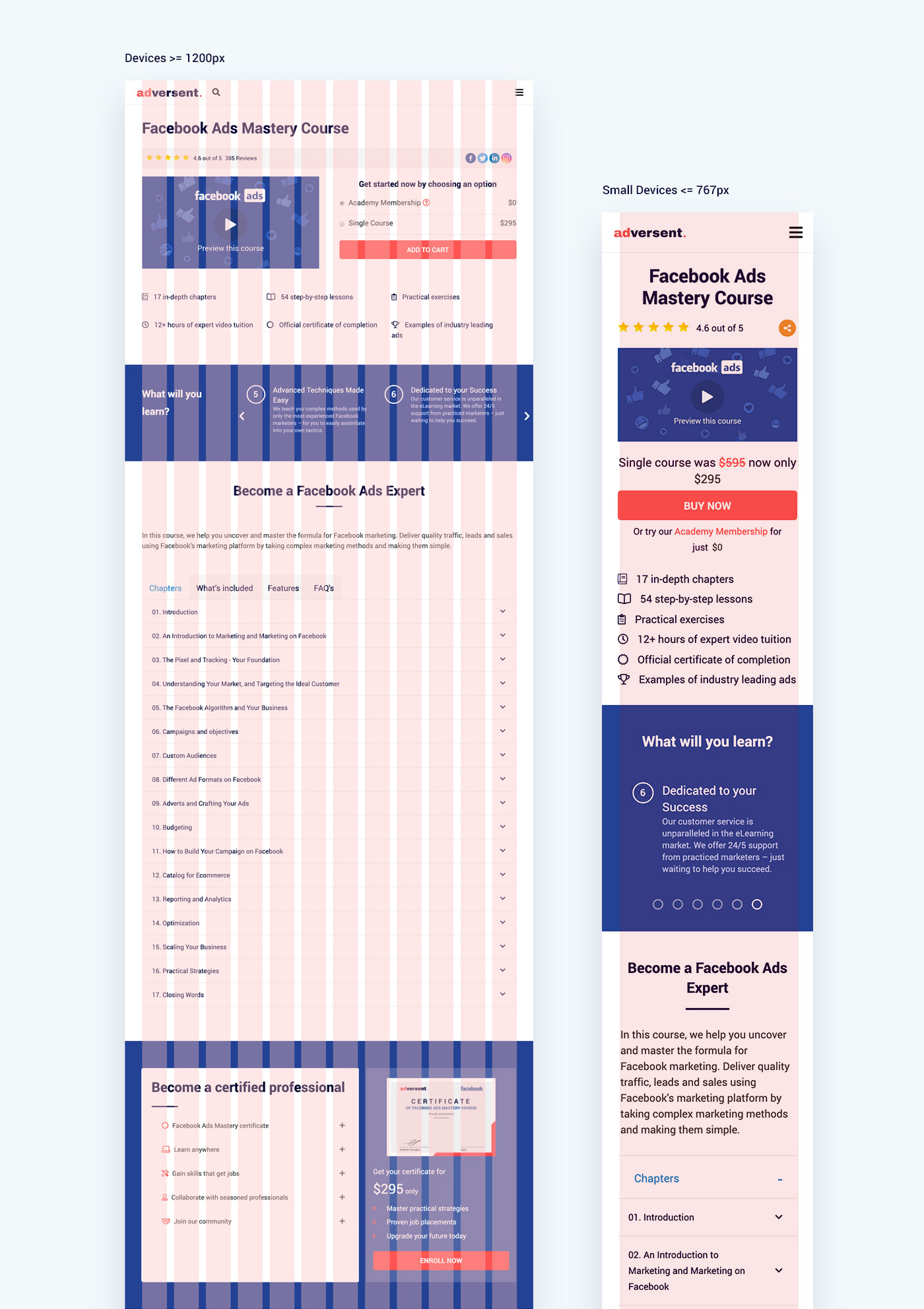
Responsive Grid: In order to organise the content & components in the most intuitive way I used a layout grid system, for which I had to be quite careful in matching my design grid with the CMS breakpoints and columns.
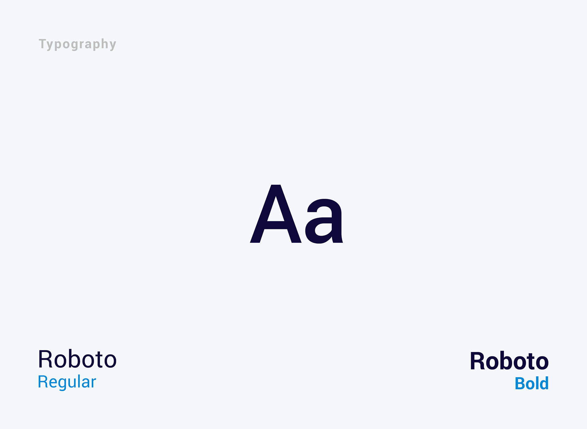
Typography: Roboto 'Bold' for headings and 'Regular' for paragraphs.

Colours: Adversent is a disruptive brand. Deep blue encourage creativity while coral brings a touch of warmness.
5. Programming
Due to the fact the platform is built on top of a CMS, we encountered a decent amount of challenges to integrate the design while dealing with the CMS constraints. We quickly realised that pairing was the way forward and so I spent a few days side by side with one of the Sr devs until we finally got it working and looking as expected.
6. Conclusion
The biggest challenge was maximising the information exposed to the user while keeping a minimal amount of text and visual elements as whole. This allowed us to have an attractive and easy to digest site that encourages the user to buy the products by its own merit.